This is the second in a series of TSM 4.10 feature highlight blogs. Today we will be discussing the new User Interface and Designs in 4.10.
This blog post is very GIF heavy to demonstrate the new functionality being discussed.
Overall Look & Feel
As we mentioned in an earlier teaser, one of the biggest areas we tackled in version 4.10 is a complete overhaul of the User Interface and the Design of the addon. Moving away from some of the bulky screens and reducing the amount of wasted space, surfacing more information in the right places and at the right time. Every screen and page has been scrutinized and rebuilt to make sure everything you do in TSM is incredibly responsive and intuitive.
Themes
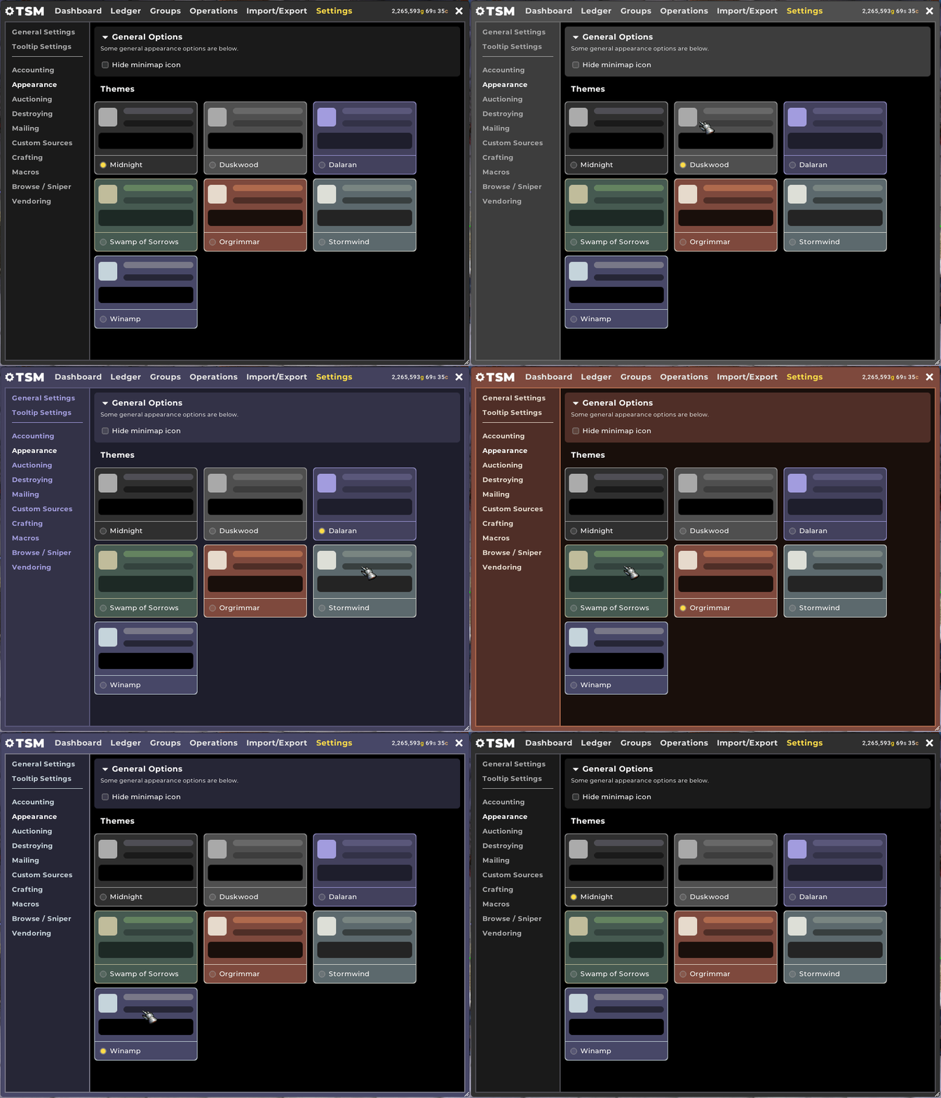
The new Default colour scheme is called ‘Midnight’, which has a darker visual approach and higher contrast than version 4.9.
Additionally, as a re-introduction of sorts from the old colour selection options in TSM3, we have implemented a Theme selector in 4.10 which will switch to new colour palette instantly. We’ll be adding more colour schemes as part of the Beta program and through to release based on your feedback and suggestions!
Dashboard
The Dashboard in TSM 4.10 is made to be the first port-of-call in your daily gold-making activities. It allows you to keep track of your status or progress towards your goals, and check some at-a-glance statistics taken from your Accounting data such as your number of daily sales, your top purchase, or your most profitable item.
The Gold Chart is now much more interactive and provides significantly more detail. You can zoom in on specific time periods, and filter by character or guild. The chart will be coloured green or red depending on whether you finished the time period with more or less gold than you started with.
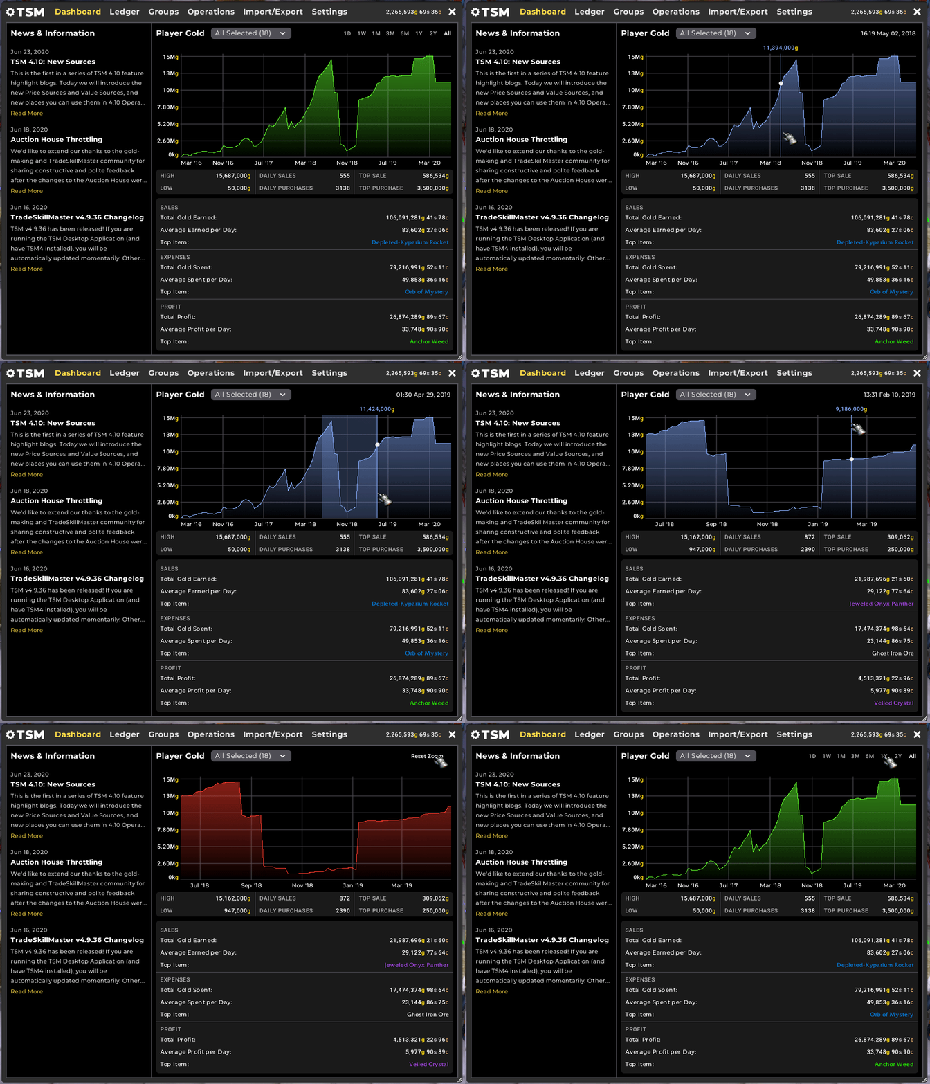
Your characters total gold is also displayed at the top right of the core TSM UI, and mousing over it will show a tooltip with how much gold you have on your other characters with a sum total of everything.
Tables
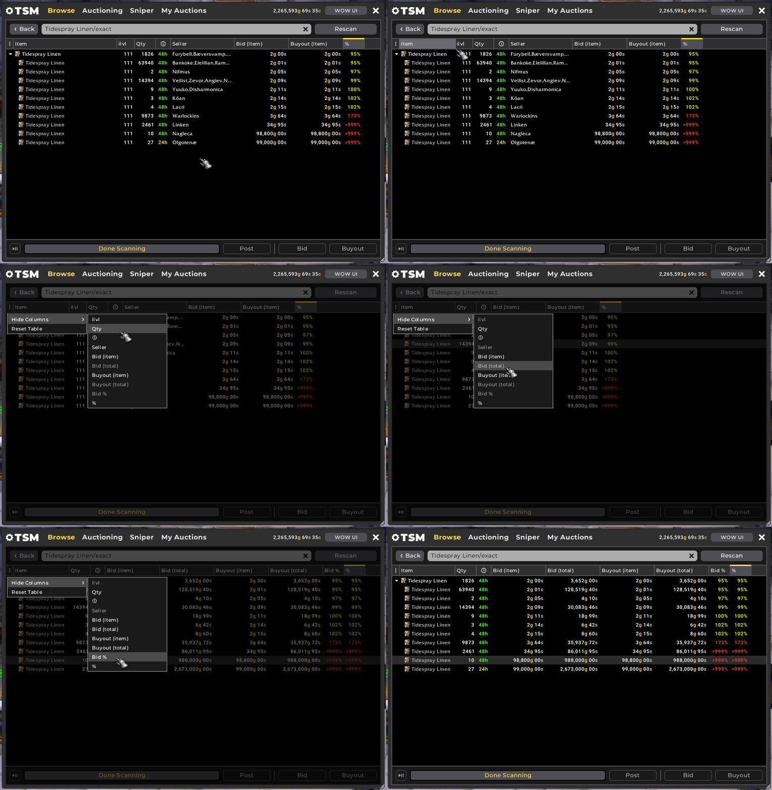
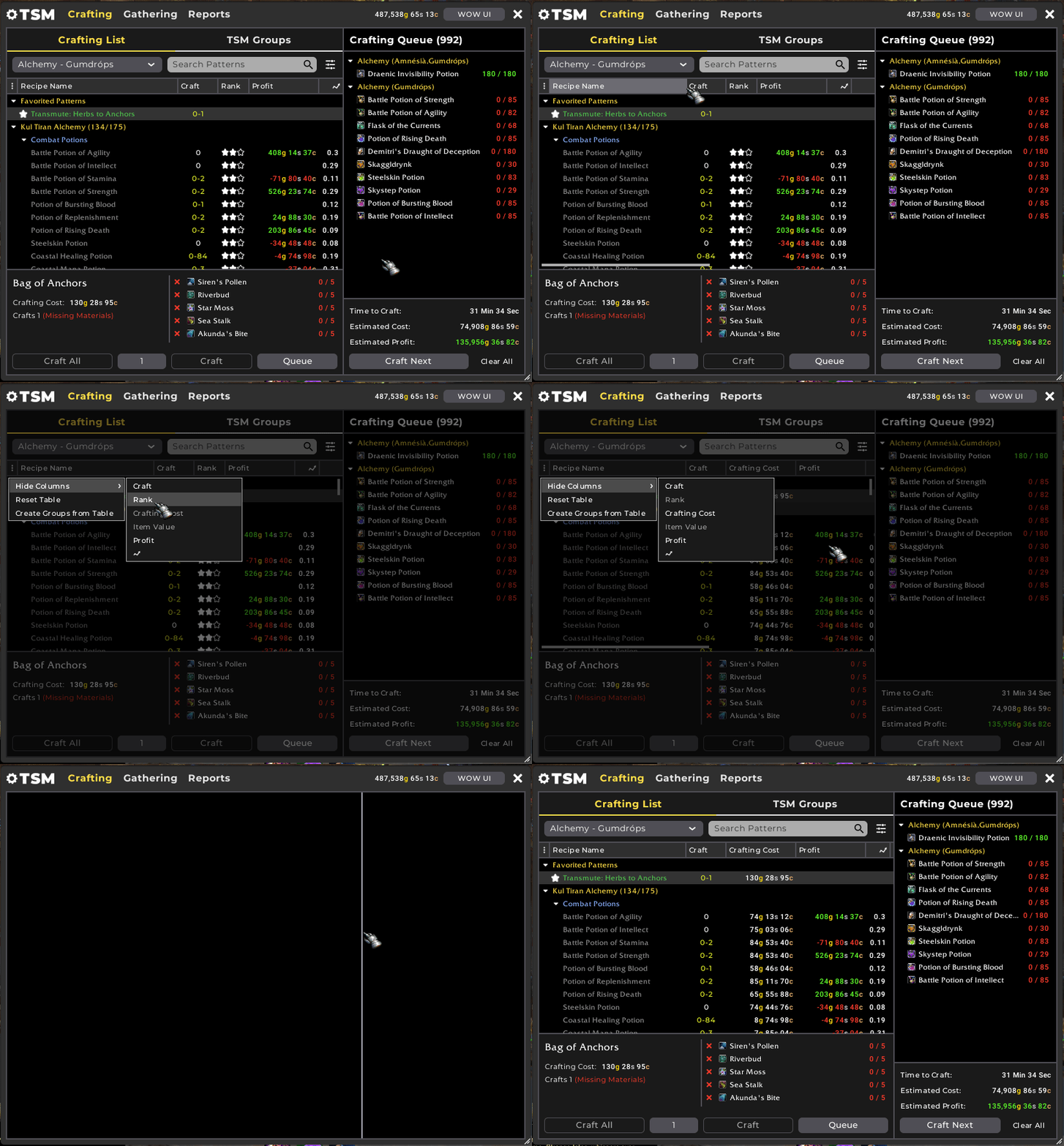
In TSM 4.9 we recognised a lot of the information displayed across the addon and the Auction House was a bit cramped, or might not be particularly necessary for certain situations. So we have turbo-charged all of the tables to allow resizing and hiding of columns across all interfaces.
Here are some examples. At the Auction House you can hide or add new columns including Buyout Total and Bid %.
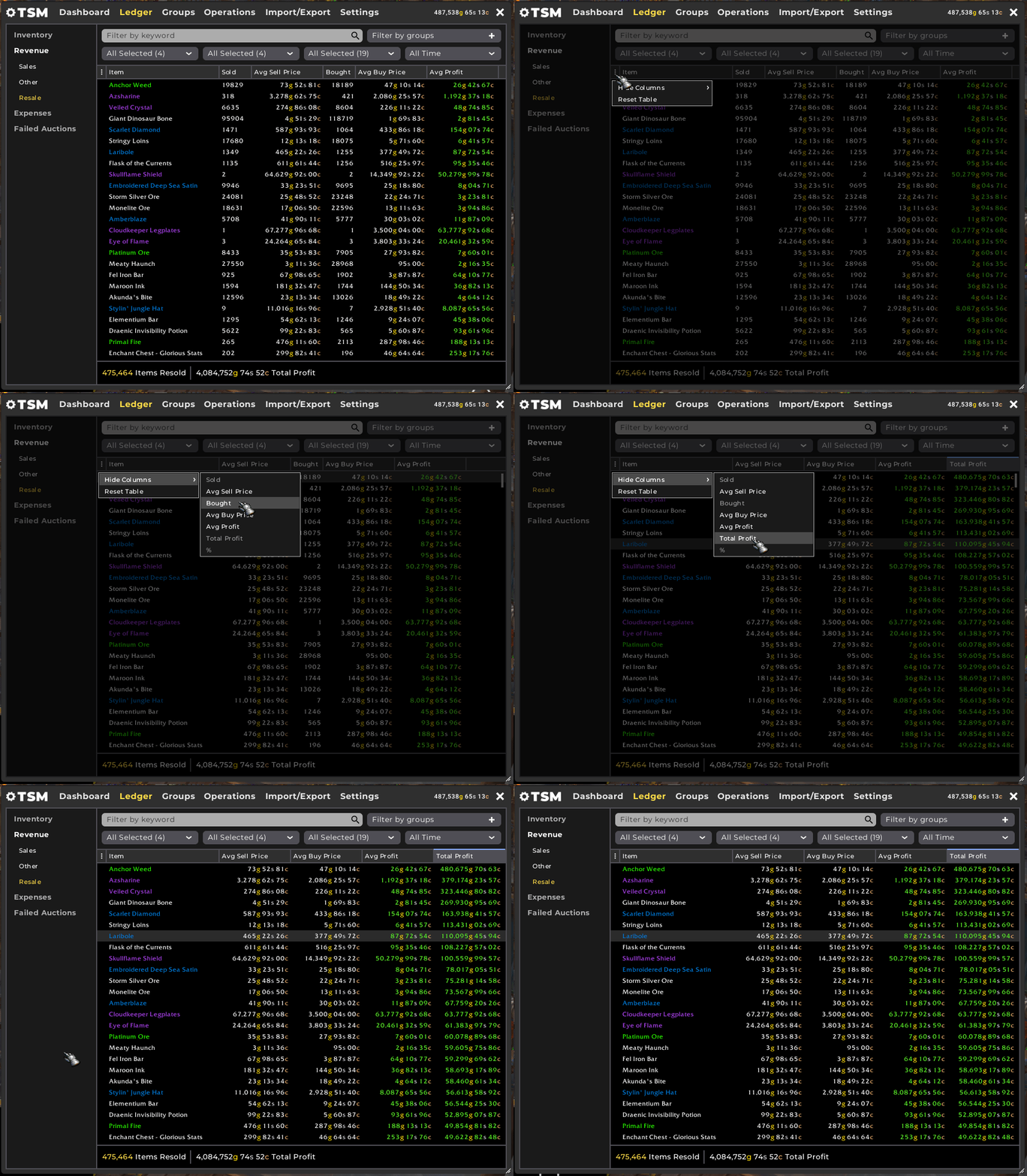
In the Ledger, you can hide or add new columns such as Total Profit per item. You will also notice a new summary at the bottom of this screen that shows the sum of both total Items Resold, and Total Profit of all items per the group and time period selected.
Where there are vertical dividers in the interface, such as the Crafting UI, these can now also be dragged left and right to be resized. Combined with table customisation this offers a lot of possibilities to tailor your addon to your specific preferences.
Group Tree
In all places that the Group Tree is surfaced, it’s now much easier to select or deselect and expand or collapse all of your groups with the options taken out of the context menu.
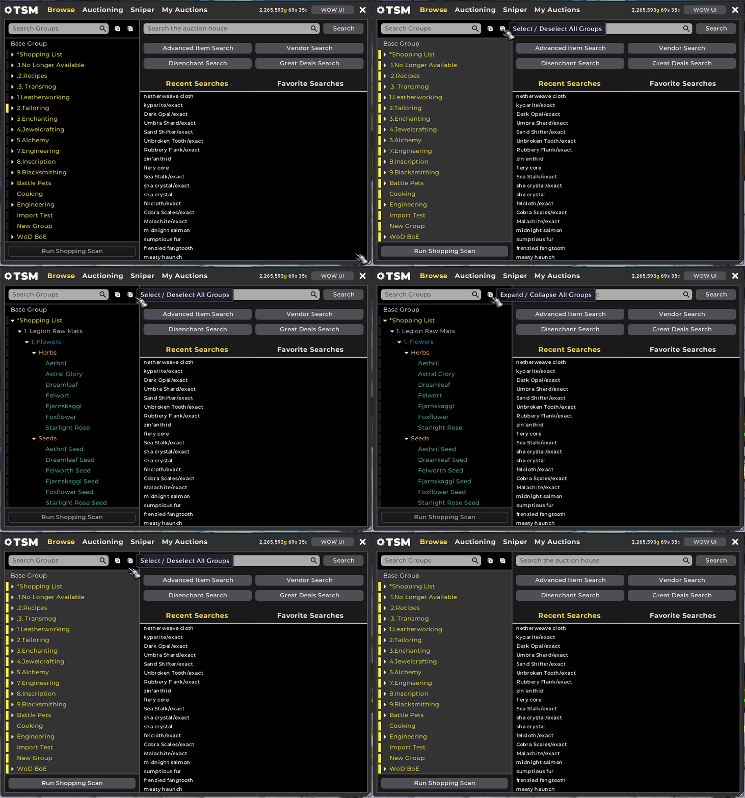
All of this UI contextual information, such as positioning, sizing, displayed/hidden columns plus Group Tree selection will be saved and persist across sessions either per character, per profile, or globally as appropriate.
Inputs & Selections
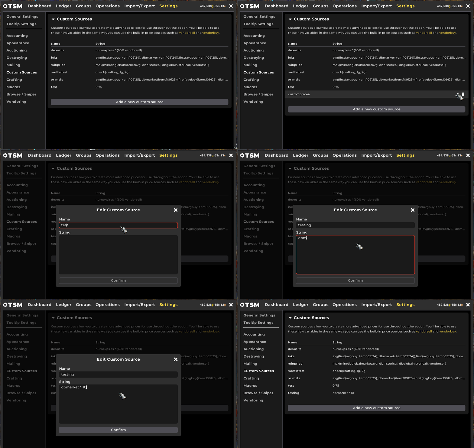
Creating Custom Sources wasn’t the most elegant experience in 4.9, so we have introduced a new dialog which also includes the validation mentioned in the previous blog. If the string you have entered is not valid, the text box will be highlighted red and saving will not be possible until the string is valid.
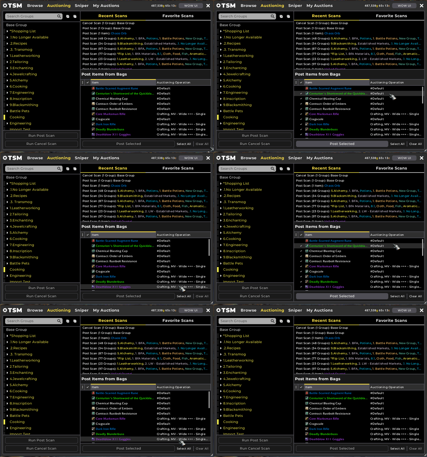
Selecting multiple items can be quite cumbersome, such as a list of items in a Group or the items shown in ‘Post From Bags’ at the Auction House. A big quality of life improvement in 4.10 is the addition of multi-select while dragging with the right mouse button held down to quickly select multiple rows.
Commodity Buying
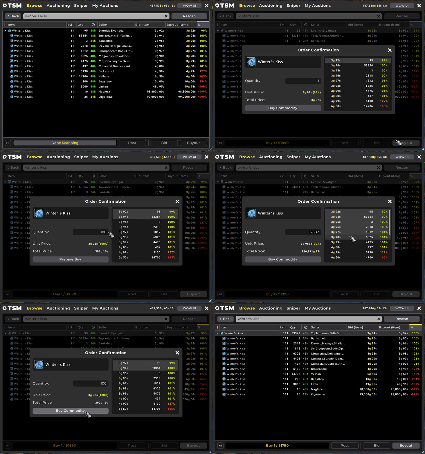
With the changes introduced in patch 8.3, there was a lot more room for improvement in the flow and process of purchasing commodity items from the Auction House. With 4.10 we have introduced a new dialog that takes inspiration from the Blizzard UI but enhances it to meet the expectations of functionality in TSM.
You can see the % at which the items are posted against your independent search or Shopping scan, plus a total buyout is dynamically updated for the quantity you are selecting to purchase. The overall experience is much smoother and quicker than before.
Sign up to the TSM 4.10 Beta!
We’re sure you’re excited to check out TSM 4.10, and we certainly can’t wait to start the Beta testing phase. You can sign up for a Beta invite by visiting our Registration page, or guarantee your access the moment it starts with a TSM Premium membership.
As always, join us on Discord to participate in the #discussion of TSM 4.10 and share your feedback!